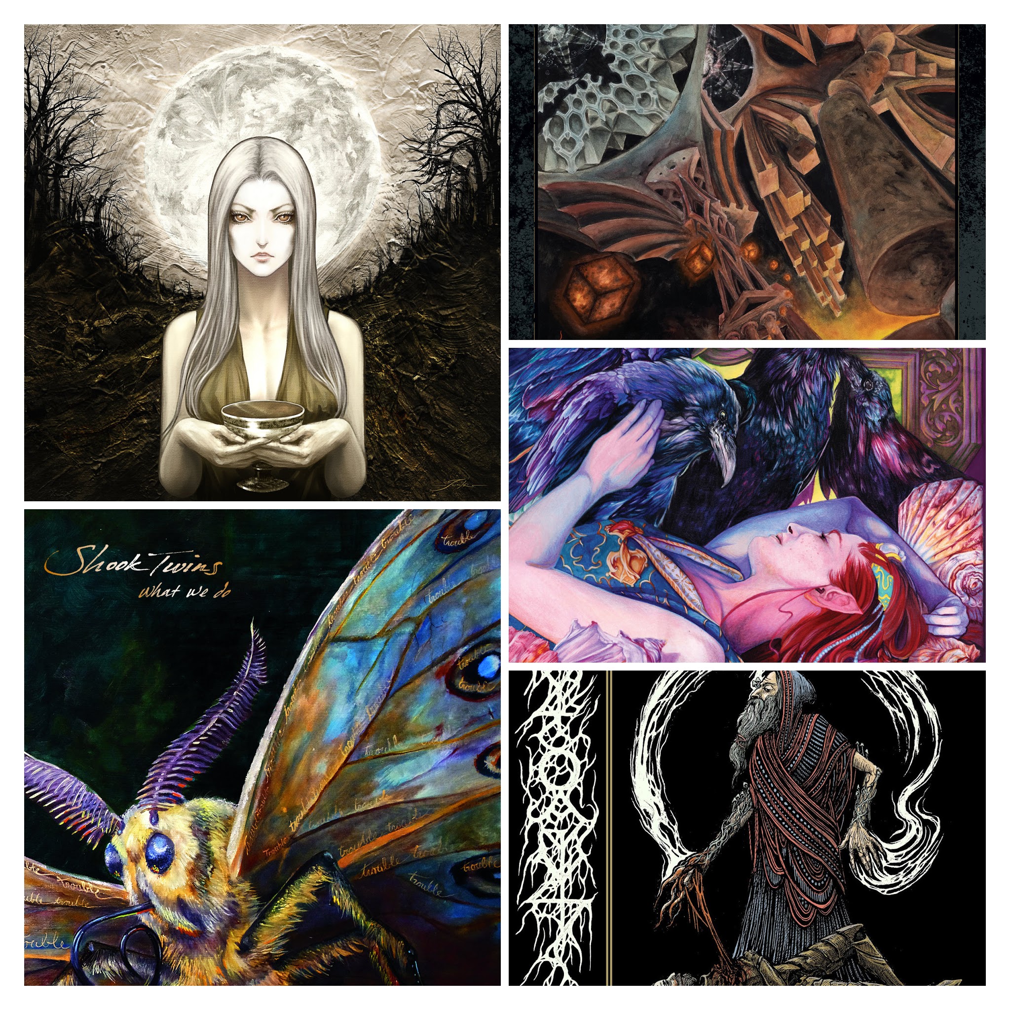
I admit it: I’m one of those people who buys wine for the label. Not the prestige of the label – for the artwork. I have a sommelier friend who assures me that it’s an entirely valid method of wine selection. If a winery has made the effort to create an exquisite label, they probably put their all into the wine, too. I think the same holds true for album covers. Of course, the contents won’t always measure up to the expectations raised by the visuals. But here are a few albums where I came for the cover and stayed for the music.
All Hell
Haha, as usual, I lead with the band that puts the lie to my intro. I heard one song from All Hell and liked it. Then when I went searching for the rest of the album, The Witch’s Grail, I discovered this exquisite artwork.

I’ve been reading a lot of Webtoons lately, and if someone wrote a story using this artwork, I would fastpass it in a heartbeat.
.
Shook Twins
I could have included Shook Twins in my post on Doe Bay bands, since they are on the 2019 lineup for that festival. I could have included them in a post on local music, since they’re from Portland. And I should start an Americana post, since so much of the indie music I listen to has a strong Americana influence. Shook Twins would be at home there, too. They were one of my favorite acts at Doe Bay this year, which deserves a post, as well.

But with cover art like they’ve got on What We Do, I had to put them here. Their music is oh so good, but even if it wasn’t, I’d have to love them for that gorgeous image.
.
Abyssal
Not to be mistaken for the Norwegian band Abyssic, the British death metal band Abyssal is equally well-named. They would be a worthy addition to a post on next-level death metal, but would you look at that album cover?

As an actual grown-up, I usually listen to death metal despite, rather than because of the artwork. In fact, tasteless artwork – especially the kind that involves women’s dead bodies – helps me filter the flood of heavy metal music. But sometimes the art is as sophisticated as the music. This cover for A Beacon in the Husk is as subterranean as the sound, its slightly steampunk aesthetic simultaneously evoking the halls of Mordor and the futuristic world of Neal Stephenson’s Anathem.
.
Grogus

Rich, somber color scheme. Images that seem narrative of a high fantasy epic, with biers under mound burials, evil wizards, doomed knights, and anachronistic, ancient Druid magics. My tattoo scripted in vapor trails or tree roots. Celtic patterns inseparable from black metal fonts. I could stare at this cover art for as long as I could listen to Grogus‘ grimy, crunchy sludge on Four Kings.
.
Arctic Sleep
Arctic Sleep describe themselves as progressive, atmospheric doom. But I only read the description after the saturated, almost electric colors of this art nouveau, Maxfield Parrish on acid image pulled me in.

Prog doesn’t always work for me, but Kindred Spirits has just the balance of crunch and harmony that absolutely does.


About the author